Friday, April 21, 2017

Final ads and evaluation


Placed in shopping malls where target audience will be buying these products, in the city


Within high saturated ad content fashion magazines


Back covers of magazines to be seen more instantly, in beauty sections


Channeling shock advertising through one of the largest industries of the Western world, the beauty industry, ensures to be seen and sneak in to so many places and unsettle the ignorant buyer in to considering more ethical choices.

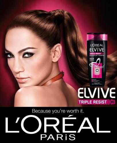
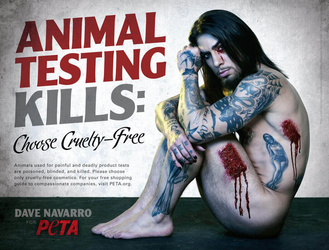
Tapping in to this industry in the medium of shock advertising techniques fit my essay in which concluded ones that have been overdone will no longer have the impact intended by using this technique. Making a contrast between the way the Western world consumes and avoids certain information, by using intense language and gory visuals placed in their familiar situations of applying MAC lipstick, LOREAL dye
etc is a way in which shock advertising can start to hit home again.

I feel doing these in an
Adbusters contrast style was risky for people to understand, but through feedback, due to the eye catching visuals and language used, peers found it an interesting way of shock advertising. Alternatively, I knew there would be more blatant ways to really shock such as using images of the suffering animals, but this is already being done and would be difficult to get the photos on my own.In conclusion, experimenting with more prototypes would have been interesting to do, such as a grafitti protest style defamation of the original ads these are based on would be a more extreme move of PETA and the fact they were tarnished would attract shock attention in itself. Despite this, for the distribution purposes and the target audience itself, these advertisements, although I should have done more concepts or even tried different area sectors such as oil companies or the food industry, conceptually would fit in to my intended distribution methods.

Tuesday, April 18, 2017

History lecture


Study Task 4 - Triangulation


Within the topic of ‘Shock Advertising:does it still work?’, it is important to be aware of key points made by authors and the time they make these points.

We begin with ‘Kepes,1944’ who states that for advertising to be a success it needs to be ‘comforting to the eye’- which completely contradicts shock advertising tactics, which are later studied and proven to give better recall of a product. Kepes would most likely be against using shock tactics, such as ‘Saunders, 1996’ making cynical points throughout his book ‘Shock in Advertising’ undermining the reasons brands have used shock advertising and cutting to what is really disturbing. For example, United Colors of Benettons use of harrowing documentary images in which they defend by saying they want to prompt discussion of taboo social topics of the time, in which he refers is a lie, with their only agenda being to sell products and that the use of these images strips them of their dignity.

As there are so many different themes of shock advertising it is hard to define if an author is completely for or against, however it is easy to see Saunders’ opinion on the tactics of controversial brand United Colors of Benetton. In concordance with this, another author ‘Kilbourne,1999’ focuses her similar tone of cynicism toward over sexualised fashion advertisements depicting violent misogynistic visuals, expressing her disgust and stripping away the lustrous image intended to the bare bone of how scary it is that that kind of violent sexual imagery is used to promote a fashion brand.

However, in more recent writings and studies, shock advertising has been more praised for it’s success. ‘Westcott,2014’ writes positively on shock advertising, noting its success in prompting breakthroughs with the public over the decades, in this example in reference to shocking advertisements used to tackle drink driving with statistics falling after such campaigns are released. In a 2011 university case study, Manral (2011) concludes shock tactics used in advertising are effective in making the advertisement be better recalled, therefore benefitting the campaigns aims and standing out amongst the increasing number of advertising we have been exposed to in the last decade among so many new platforms.
‘Cozens, 2003’ makes points that agree with this, just that they need to be directed to the correct target audience in the correct medium for them to be as successful as possible.

In line with the cynicism tone of Saunders and Kilbourne, now it is also discussed that these tactics are now overdone and the consumer has become desensitized to its affects. ‘Urwin, 2014’ argues that shock advertising tactics need to be readjusted in concordance with our society for them to still work and for the tactic to not become obsolete. This is also due to the amount of information we are exposed to in our modern day Western society.

In conclusion, as time has gone on, and the advertising tactic has been studied, shock advertising has certainly been a successful tool but it is crucial it is adjusted and put in accordance with these fast paced times.

Study Task 078 - SB2 - Pitching your ides / further developments


Main ideas on top of legal high ideas-
Idea 1 feedback for ads exposing dark sides of companies prompted suggestion of looking in to Adbusters style of doing this mimicking the same branding and design of adverts with a twist. It was pointed out however that I would need to narrow it down to a specific company to do this under, under a specific sector perhaps would amplify my concept. I then decided to focus on the beauty industry.

Idea 2 feedback for making standard adverts scary and shocking to showcase the tactics used for shock advertising, didn't get as much feedback as I lacked strong ideas of how to do this apart from in a film sense adding horror movie theme tactics and lacking knowledge in film making this would have been harder to do well.

Idea 3 feedback was understood but peers reminded me of the red sugar warnings on all food packaging and I remembered the ad showing how many sugar cubes that were in fizzy drinks circulating, meaning I felt this may not be as strong as my first idea pitch.

The below sectors were a pitch for 'illegal highs' project proposal which was changed after lack of understanding from many in feedback, so I chose to do something that was more of a popular and understood topic. With the issue intended to be the focus now discussed on national news with the Spice crisis, this would have been relevant to do for my practical in Manchester definetley but my final pitch was more internationally relevant.


Monday, April 17, 2017

Practical work, feedback and adjustments

The Body Shop

This brand was targeted for the practical as they promote being as ethical and anti-cruelty as possible, but last year in a scandal that came out, it became known they were in fact bought by L'oreal who still animal test. This made remaking their latest campaign interesting to work with, using the composition and design style, and twisting their words in aid of promoting anti animal testing in Peta's dramatic fashion.


Three variations- some with more focus on the blood red bath which imitates the blood of the animals dying due to the animal testing from buying bath products from Body Shop. The use of red in the bath, the lipstick, and on the campaign title are striking and alarming, and are intended to shock and make the consumer question why the bath is blood red. This will prompt them to read the text which I wanted to keep short as possible but give explanation, as it is quite shocking Body Shop haven't adressed the controversy due to their intended brand image to become the most ethical brand 'ever'. Throughout these ads synonyms for 'torture' were used to keep the language varied but as impactful as possible.

In feedback gathered, the first two images were favoured as the red looks more dramatic and bloodlike. A critique was that they understood how I intended to design these to mimic the originals, however for maximum shock include the brand name within to ensure full impact.


The colour red used in design to alert danger, will instantly attract the consumer along with the blood looking out of place of the beauty ad context of the designs. Using the gradient illumination such as in the advert in red looks like it would fit in place of a hair product ad, with the model lost in the moment like one of the herbal essences models, but with the twist of blood in the product and on her hands. The tag used continually is a brash wake up call to the beauty buyers and sits with the theme consistently. Typefaces as similar as possible along with twists on language used in the adverts are used for maximum familiarity and contrast.

The change to red was favoured and makes the ad more eye catching as it doesn't look as gorey as it could have done, but the message itself and dramatic title of 'agony' will stand out due to its shocking language amongst every day ads which was the aim. Also, another comment was that with the face being towards the camera it makes the message more direct to the consumer and harder to avoid. Will include the brand name of Loreal with in the text.

Previous backgrounds in which emulating the pink didn't work with the red consistency needed for shock, and white made them look too different to the original advert- less lustrous feeling, as one of my distribution ideas is to place these in fashion magazines against animal testing, therefore they need to have a style fitting for the rest of the pages.


Keeping the images upclose for emphasis on the bloody lips, and actually using a red mac lipstick to truly emulate a typical MAC lipstick advert in this ad keeps the vain ignorance of animal testing well. This is done as a pastiche showcasing the blood lost to make that line of lipsticks in aim of alerting the consumer visually rather than just with words, in aid of them directing their money to a brand not using animal testing and to do their research on which they can look to PETA for.

Comments on these were that the contrast of the visual style of the MAC ad and pose, along with the blood and change of the MAC title suit its purpose. The first in which she is looking is more sinister and there is more of an emotional connection which deepens the message. The font was said to look too clumped to be read with ease so if possible to substitute for a clearer script font, this would benefit the speediness of the message.

Sunday, April 16, 2017

Photoshoot plan for practical work and anti-animal testing company


Have had trouble with models cancelling on me so as a back up I have chosen these licence free stock images for worst case scenario of not being able to do my own photoshoot, as using photos of real people is needed for the shock high impact of my concept most appropriate to support my shock advertising essay. The essence of my concept is that in the modern day, shocking advertising has to be slipped in to advertising for vanity or else the advertising is shunned due to negative nature. Such as the Corsodyl advert- you see a pretty woman getting ready for a night out, then the shock of seeing such a person with a front tooth missing: it shocks the watcher in to questioning the blood when they are brushing, that they need to buy Corsodyl.


Corsodyls advertising technique is perfect for my aim of the practical, luring the consumer in by their own vanity by looking like their usual favourite beauty brand but tarnishing their existing associations of feeling beautiful using loreal, mac and body shop by showcasing the result of their choices of buying from them, that they have blood on their hands. Scenes like these are mostly showed in horror films which consumers flock to see for the shock, but I want to showcase a real life horror story by buying blindly.


Lush


This brand are constantly promoting their anti-animal testing values, and are very blatant about it. I have seen so many of their totebags against animal testing in day to day which is a clever simple statement. Their campaign performance however was not so simple- showing the pain and suffering of animal testing using a human prompted many shocked discussions and was an extreme but desperate call to the consumer to recognize the reality of their choices and to simply do their research and buy from Lush and elsewhere, eradicating animal testing. They even go as far to award those who work fighting animal testing. Lush are a very admirable brand in my opinion with nothing to hide- speaking to Lush employees I know, they are very much representations of the brand. I found out about the Body Shop being bought out with proceeds going to animal testing from one of their employees, which really did surprise me due to the brands image. Perhaps assigning my shoot towards Lush's brand can be part of their few but shocking campaigns and open the eyes of customers who buy from Body Shop for similar products too.


PETA


The most high profile, international, most experienced in shocking bloody visuals in their campaigning in advert styles in which I aim to create. PeTA are known for their use of high profile celebrities for higher impact of different target audiences, and gory imagery used to shock those seeing the adverts in to showcasing their anger and the brutal truth of animal testing so that audiences look in to and think twice about buying from certain brands. The difference with mine being, mine are for specific brands. This is extreme to target brands specifically but in the long history of shocking publicity stunts and high profile shock campaigning by PeTA, this may be the ideal name to assign my images to as it echoes how PeTA have worked to raise awareness on animal testing, now from a slightly different angle. When editing I will use the latest brand logos to keep in tap with the latest look of the brands advertising and to keep in place with it's current visual stratedgies and connotations with public.

Tuesday, April 4, 2017

Dissertation proposal brainstorms

Picked the two questions i was most interested in and began to brainstorm.


Question 5 gave the most interesting options for me personally


It feels to me that the post-punk ideas and aesthetics that have influenced you are hard to pin down – or at least more so than straight-up punk, for instance. Can you tell me a little more about what you feel post-punk means to you, and how it shaped your output?The whole notion of post-punk has probably been our most important inspiration, throughout the years. As we already mentioned in previous interviews – it is through all the various post-punk subcultures in which we were involved (as kids growing up in the 80s) that we became interested in graphic design in the first place. Psychobilly, two-tone ska, new wave, mod, oi, industrial noise, garage rock, skate punk, US hardcore – it was subcultures like these that made us aware of this whole graphic sphere of band logos, record sleeves, fanzines, mini comics, mail art, mix tapes, T-shirt prints, buttons, badges, patches, etc. In a lot of our work, we are still referring to exactly this graphic sphere. 

http://www.itsnicethat.com/features/experimental-jetset-interview-280616
Music/pop culture identity