The Body Shop
This brand was targeted for the practical as they promote being as ethical and anti-cruelty as possible, but last year in a scandal that came out, it became known they were in fact bought by L'oreal who still animal test. This made remaking their latest campaign interesting to work with, using the composition and design style, and twisting their words in aid of promoting anti animal testing in Peta's dramatic fashion.


Three variations- some with more focus on the blood red bath which imitates the blood of the animals dying due to the animal testing from buying bath products from Body Shop. The use of red in the bath, the lipstick, and on the campaign title are striking and alarming, and are intended to shock and make the consumer question why the bath is blood red. This will prompt them to read the text which I wanted to keep short as possible but give explanation, as it is quite shocking Body Shop haven't adressed the controversy due to their intended brand image to become the most ethical brand 'ever'. Throughout these ads synonyms for 'torture' were used to keep the language varied but as impactful as possible.
In feedback gathered, the first two images were favoured as the red looks more dramatic and bloodlike. A critique was that they understood how I intended to design these to mimic the originals, however for maximum shock include the brand name within to ensure full impact.

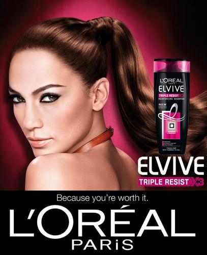
The colour red used in design to alert danger, will instantly attract the consumer along with the blood looking out of place of the beauty ad context of the designs. Using the gradient illumination such as in the advert in red looks like it would fit in place of a hair product ad, with the model lost in the moment like one of the herbal essences models, but with the twist of blood in the product and on her hands. The tag used continually is a brash wake up call to the beauty buyers and sits with the theme consistently. Typefaces as similar as possible along with twists on language used in the adverts are used for maximum familiarity and contrast.
The change to red was favoured and makes the ad more eye catching as it doesn't look as gorey as it could have done, but the message itself and dramatic title of 'agony' will stand out due to its shocking language amongst every day ads which was the aim. Also, another comment was that with the face being towards the camera it makes the message more direct to the consumer and harder to avoid. Will include the brand name of Loreal with in the text.
Previous backgrounds in which emulating the pink didn't work with the red consistency needed for shock, and white made them look too different to the original advert- less lustrous feeling, as one of my distribution ideas is to place these in fashion magazines against animal testing, therefore they need to have a style fitting for the rest of the pages.
Keeping the images upclose for emphasis on the bloody lips, and actually using a red mac lipstick to truly emulate a typical MAC lipstick advert in this ad keeps the vain ignorance of animal testing well. This is done as a pastiche showcasing the blood lost to make that line of lipsticks in aim of alerting the consumer visually rather than just with words, in aid of them directing their money to a brand not using animal testing and to do their research on which they can look to PETA for.
Comments on these were that the contrast of the visual style of the MAC ad and pose, along with the blood and change of the MAC title suit its purpose. The first in which she is looking is more sinister and there is more of an emotional connection which deepens the message. The font was said to look too clumped to be read with ease so if possible to substitute for a clearer script font, this would benefit the speediness of the message.


No comments:
Post a Comment