Monday, April 24, 2017

End of module self evaluation


Hannah Rottger
End of module evaluation OUGD501

Within COP2 my willingness to dig deep and search for the right extracts has been a learning curve and an enjoyable practice. I typically enjoy writing about subjects not as obvious and although it would have been easier doing a more written about subject, finding the sources was very beneficial in improving my searching skills, especially in the library, borrowing around 5 books at a time.

Throughout the essay, what intrigued me was all different mediums in which shock tactics were used blatantly or not, which reveals a lot about the advertising industry and how they make consumers recall their products. Looking in to United Colors of Benetton in more detail and seeing different opinions such as Saunders cynical outlook was also very interesting and built up an unconventional tone within my essay making it more interesting to write.

My practical inspires me to look in to behind the scenes of brands and to do my research, and my minor research on Lush cosmetics has pushed me to want to look in to their ethos more as it seems to be in line with my beliefs also, making it a potential company to research for my dissertation next year.

Arranging concepts for photoshoots has also been something that I thoroughly enjoyed planning, despite being behind due to my initial model bailing, I feel the concept held it’s success. Retrospectively, I wish I did more with this time of uncertainty and made prototypes of other focuses other than the beauty industry. However, my practical supports my essays essence that typically the consumer will avoid blatant shock tactics in fear of being guilt tripped, but how mine is styled in the Adbusters style creates a twist that takes them from vanity to shock.

Looking in to my topic for dissertation, I didn’t want to just look at one idea so looked in the library for as many books as I could to locate the best extracts and which topic I considered would have the most depth and backup as it is a lot longer than in second year. I look forward to getting in to the dissertation, and feel more prepared now that this year I have really taken on board feedback and how to Harvard reference and write correctly, such as not appearing biased or opinionated in my writing which I usually struggle with.

OUGD501 has been useful in stepping up my writing and research skills and I have found the lectures thoroughly enjoyable. In future I really need to create as many prototypes as I can and expand my research methods for my dissertation by getting face to face source information. Focusing my research on an element of graphic design I really enjoy will hopefully propel my skills further, creating more prototypes and sharpening my contextual research up which I also feel isn’t up to scratch. Overall the module has been very beneficial to reaching the right standard of academic writing and research.

COP3 Dissertation Proposal

Printed off due to technical error with Issu

Sunday, April 23, 2017

COP3 quotes

'Because our society values attractiveness so highly, we tend to set predetermined notions about people judging them solely by their looks. Attractiveness and this “fantasy-element,” are directly related to a woman’s appearance' (Chaiko, R) The Mystery of Sex in Advertising accessed April 2017
http://www.mhlearningsolutions.com/commonplace/index.php?q=node/5957

'There are plenty of sexy images produced by hard-core illustrators, photographers, and designers each year, but graphic design is actually neuter, neither male or female, a clean slate. A designer can inject sex appeal into design through word or picture, but unlike a piece of clothing, for instance, a piece of graphic design is never inherently sexy.'
(Heller, S) 

Graphic Design Rants and Raves: Bon Mots on Persuasion, Entertainment, Education, Culture, and Practice Year: 2016'Dismissals of style ignore the complex ways in which style operates in society: how styles circulate as communicative codes that distinguish cultural groups and social classes.' (Blauvelt, A) Eye magazine 1995Under The Surface of Style accessed April 2017
http://www.eyemagazine.com/feature/article/under-the-surface-of-style

'...sex appeal is a matter of fact. It pervades every facet of mass communication, from art to commerce, and it is such a common component in advertising and graphic design that it's existence goes without saying. However, it's very recurrence is the reason for continual reinvention.' (Heller, S)
Sex Appeal Year:2000 Publisher: Allworth Press New York

'Consumer culture is best supported by markets made up of sexual clones, men who want objects and women who want to be objects, and the object desired ever-changing, disposable, and dictated by the market.' (Wolf,N) The Beauty Myth Year:1991 Publisher: Vintage London


Look in to how Lush are taught in make up inductions how beauty cosmetics for women are named in order to tie in to their insecurities

Friday, April 21, 2017

Final ads and evaluation


Placed in shopping malls where target audience will be buying these products, in the city


Within high saturated ad content fashion magazines


Back covers of magazines to be seen more instantly, in beauty sections


Channeling shock advertising through one of the largest industries of the Western world, the beauty industry, ensures to be seen and sneak in to so many places and unsettle the ignorant buyer in to considering more ethical choices.

Tapping in to this industry in the medium of shock advertising techniques fit my essay in which concluded ones that have been overdone will no longer have the impact intended by using this technique. Making a contrast between the way the Western world consumes and avoids certain information, by using intense language and gory visuals placed in their familiar situations of applying MAC lipstick, LOREAL dye
etc is a way in which shock advertising can start to hit home again.

I feel doing these in an
Adbusters contrast style was risky for people to understand, but through feedback, due to the eye catching visuals and language used, peers found it an interesting way of shock advertising. Alternatively, I knew there would be more blatant ways to really shock such as using images of the suffering animals, but this is already being done and would be difficult to get the photos on my own.In conclusion, experimenting with more prototypes would have been interesting to do, such as a grafitti protest style defamation of the original ads these are based on would be a more extreme move of PETA and the fact they were tarnished would attract shock attention in itself. Despite this, for the distribution purposes and the target audience itself, these advertisements, although I should have done more concepts or even tried different area sectors such as oil companies or the food industry, conceptually would fit in to my intended distribution methods.

Tuesday, April 18, 2017

History lecture


Study Task 4 - Triangulation


Within the topic of ‘Shock Advertising:does it still work?’, it is important to be aware of key points made by authors and the time they make these points.

We begin with ‘Kepes,1944’ who states that for advertising to be a success it needs to be ‘comforting to the eye’- which completely contradicts shock advertising tactics, which are later studied and proven to give better recall of a product. Kepes would most likely be against using shock tactics, such as ‘Saunders, 1996’ making cynical points throughout his book ‘Shock in Advertising’ undermining the reasons brands have used shock advertising and cutting to what is really disturbing. For example, United Colors of Benettons use of harrowing documentary images in which they defend by saying they want to prompt discussion of taboo social topics of the time, in which he refers is a lie, with their only agenda being to sell products and that the use of these images strips them of their dignity.

As there are so many different themes of shock advertising it is hard to define if an author is completely for or against, however it is easy to see Saunders’ opinion on the tactics of controversial brand United Colors of Benetton. In concordance with this, another author ‘Kilbourne,1999’ focuses her similar tone of cynicism toward over sexualised fashion advertisements depicting violent misogynistic visuals, expressing her disgust and stripping away the lustrous image intended to the bare bone of how scary it is that that kind of violent sexual imagery is used to promote a fashion brand.

However, in more recent writings and studies, shock advertising has been more praised for it’s success. ‘Westcott,2014’ writes positively on shock advertising, noting its success in prompting breakthroughs with the public over the decades, in this example in reference to shocking advertisements used to tackle drink driving with statistics falling after such campaigns are released. In a 2011 university case study, Manral (2011) concludes shock tactics used in advertising are effective in making the advertisement be better recalled, therefore benefitting the campaigns aims and standing out amongst the increasing number of advertising we have been exposed to in the last decade among so many new platforms.
‘Cozens, 2003’ makes points that agree with this, just that they need to be directed to the correct target audience in the correct medium for them to be as successful as possible.

In line with the cynicism tone of Saunders and Kilbourne, now it is also discussed that these tactics are now overdone and the consumer has become desensitized to its affects. ‘Urwin, 2014’ argues that shock advertising tactics need to be readjusted in concordance with our society for them to still work and for the tactic to not become obsolete. This is also due to the amount of information we are exposed to in our modern day Western society.

In conclusion, as time has gone on, and the advertising tactic has been studied, shock advertising has certainly been a successful tool but it is crucial it is adjusted and put in accordance with these fast paced times.

Study Task 078 - SB2 - Pitching your ides / further developments


Main ideas on top of legal high ideas-
Idea 1 feedback for ads exposing dark sides of companies prompted suggestion of looking in to Adbusters style of doing this mimicking the same branding and design of adverts with a twist. It was pointed out however that I would need to narrow it down to a specific company to do this under, under a specific sector perhaps would amplify my concept. I then decided to focus on the beauty industry.

Idea 2 feedback for making standard adverts scary and shocking to showcase the tactics used for shock advertising, didn't get as much feedback as I lacked strong ideas of how to do this apart from in a film sense adding horror movie theme tactics and lacking knowledge in film making this would have been harder to do well.

Idea 3 feedback was understood but peers reminded me of the red sugar warnings on all food packaging and I remembered the ad showing how many sugar cubes that were in fizzy drinks circulating, meaning I felt this may not be as strong as my first idea pitch.

The below sectors were a pitch for 'illegal highs' project proposal which was changed after lack of understanding from many in feedback, so I chose to do something that was more of a popular and understood topic. With the issue intended to be the focus now discussed on national news with the Spice crisis, this would have been relevant to do for my practical in Manchester definetley but my final pitch was more internationally relevant.


Monday, April 17, 2017

Practical work, feedback and adjustments

The Body Shop

This brand was targeted for the practical as they promote being as ethical and anti-cruelty as possible, but last year in a scandal that came out, it became known they were in fact bought by L'oreal who still animal test. This made remaking their latest campaign interesting to work with, using the composition and design style, and twisting their words in aid of promoting anti animal testing in Peta's dramatic fashion.


Three variations- some with more focus on the blood red bath which imitates the blood of the animals dying due to the animal testing from buying bath products from Body Shop. The use of red in the bath, the lipstick, and on the campaign title are striking and alarming, and are intended to shock and make the consumer question why the bath is blood red. This will prompt them to read the text which I wanted to keep short as possible but give explanation, as it is quite shocking Body Shop haven't adressed the controversy due to their intended brand image to become the most ethical brand 'ever'. Throughout these ads synonyms for 'torture' were used to keep the language varied but as impactful as possible.

In feedback gathered, the first two images were favoured as the red looks more dramatic and bloodlike. A critique was that they understood how I intended to design these to mimic the originals, however for maximum shock include the brand name within to ensure full impact.


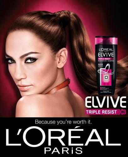
The colour red used in design to alert danger, will instantly attract the consumer along with the blood looking out of place of the beauty ad context of the designs. Using the gradient illumination such as in the advert in red looks like it would fit in place of a hair product ad, with the model lost in the moment like one of the herbal essences models, but with the twist of blood in the product and on her hands. The tag used continually is a brash wake up call to the beauty buyers and sits with the theme consistently. Typefaces as similar as possible along with twists on language used in the adverts are used for maximum familiarity and contrast.

The change to red was favoured and makes the ad more eye catching as it doesn't look as gorey as it could have done, but the message itself and dramatic title of 'agony' will stand out due to its shocking language amongst every day ads which was the aim. Also, another comment was that with the face being towards the camera it makes the message more direct to the consumer and harder to avoid. Will include the brand name of Loreal with in the text.

Previous backgrounds in which emulating the pink didn't work with the red consistency needed for shock, and white made them look too different to the original advert- less lustrous feeling, as one of my distribution ideas is to place these in fashion magazines against animal testing, therefore they need to have a style fitting for the rest of the pages.


Keeping the images upclose for emphasis on the bloody lips, and actually using a red mac lipstick to truly emulate a typical MAC lipstick advert in this ad keeps the vain ignorance of animal testing well. This is done as a pastiche showcasing the blood lost to make that line of lipsticks in aim of alerting the consumer visually rather than just with words, in aid of them directing their money to a brand not using animal testing and to do their research on which they can look to PETA for.

Comments on these were that the contrast of the visual style of the MAC ad and pose, along with the blood and change of the MAC title suit its purpose. The first in which she is looking is more sinister and there is more of an emotional connection which deepens the message. The font was said to look too clumped to be read with ease so if possible to substitute for a clearer script font, this would benefit the speediness of the message.