Sunday, April 24, 2016

Advertisement Production

Now I have completed my shoot in the studio, using two women and a man giving me th poe option to explore a range of potential final advertisements. I want to experiment with close variations of my updated 'we can do it campaign' using both 'we can still do it' or 'we can all do it.' This is to ensure I get the solid message of the outcome portrayed correctly ready for hand in. Not having my models in the vintage ensemble means I am completely remaking these, but will try and encorporate the typeface and colours used to match the iconic pose but this is meant to be a new direction for this idea modernising peoples views and opinions on gender stereotyping.

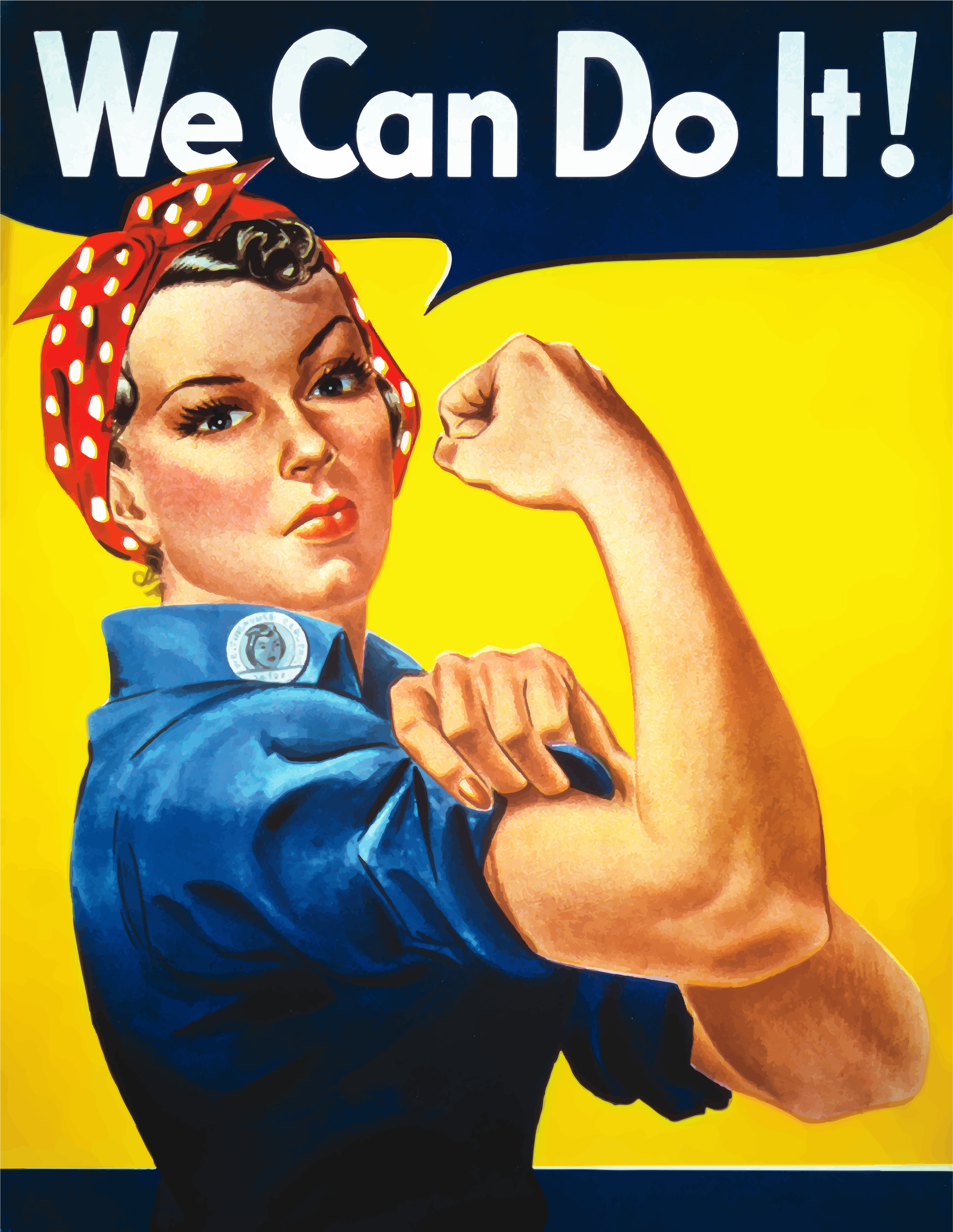
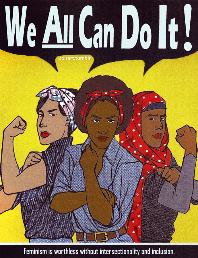
The closest to the typeface I could find had to be bought, so I decided to go my own way and use one I feel more represents modern day statement text, going with my point of sterotypes being out of date the style of the poster is itself. I found a strong, modern typeface 'Brandon Grotesque' similar to the original but I didn't think its softness made the important statement I am trying to make.In the posters time of the war the text was light motivation to boost worker morale as it was a sensitive situation at the time as the women's husbands and sons were out fighting the war therefore it had to be light in its message but strong in image, whereas with these ads I want the message to be seen at full force.

A bold capital font would get the message across that this is something that needs to be taken in to consideration, that it's time for these stereotypes to change; this needs to grab attention from all directions. As this is so important for this advertising to work, I researched which were the top impactful headline fonts and those used most by designers allowing me to choose the one that stands out most and that is used most in this modern day to make this modernized campaign work to its full potential.

https://designschool.canva.com/blog/headline-font/

Franchise- demonstrates power and strength through its all capital character


The bold font- used in my initial billboard which seemed succesful with those I showed it to which isn't as rigid and has a softness to it

Asking others and thinking about it myself, I feel the bold font is still as loud eyecatching and strong as the other, but has more of a spirit to it which I want portrayed through the advertising whereas Franchise is a little rigid.

If it were to be done in my first attempt style I would use blue/pink reversed and it would look like this


Thursday, April 21, 2016

Ad campaign plan

I have been rattling my brain of how I can successfully include the spirit of my essay through advertising and have had the ideas of cut out dolls/blue and pink/stereotype switch but with much confusion of how to portray them in the correct way with impact. I realised it needs to be clear to others and if it isn't clear to myself then it would be unsuccessful.


The ad that has come to mind and is very famous but the reality pretty much discarded after WW2 was the 'We can do it' poster encouraging women to take on men's roles why they were away at war. If i were to recreate this as a modern version, either for women with the tagline 'we can still do it' highlighting the disregard of the women's effort and inequality brought back when the men returned from war. I think this would be a pretty powerful campaign as the pose and poster is well known and the familiarity will make audiences connect to it more, and the simple image and tagline are bold and direct enough to get across my point that they were encouraged to take control when the men weren't here and did well at it, why was this completely disregarded? Especially as we are nearly a century on. These could be ads for UN Women or similar organisations, or a made up campaign to give it the backbone it needs to be for gender in advertising as social advertisements on equality all have the organisation small in the corner to give the person seeing it a directory to help create change, but allowing the advertisement to be strong and direct message to stick in the persons mind.

This could also be done one ad a woman and another a man, with the tagline 'we can all do it'. This would be a very positive message in comparison to my initial poster mockup which is probably quite aggressive and wouldn't sit well with all women for lifestyle/religious reasons. This sort of modernised campaign will give empowerment and motivation, and reflects the hopeful and positive tone of voice of my essay that the gender gap will lessen over the coming years.

What I love about the Riveter poster is its bold straight to the point message, strong stance of the working woman whilst still with the touch of femininity and elegancy which I want to uphold in my work. Femininity is to be celebrated but strength and abilities not underestimated because of it. For example, in my essay when I discuss quotes from Hollywood superstars getting annoyed at belittling comments because they are a woman, asking all the intellectual questions to the male actor.

This American propaganda poster to boost worker morale was actually seen very little in wartime but was rediscovered in the 1980's, and has been used for feminist campaigns and other political issues due to its clear and direct meaning. 'Feminists and others have seized upon the uplifting attitude and apparent message to remake the image into many different forms, including self empowerment, campaign promotion, advertising, and parodies.' (source Wikipedia)


A standard recreation of the poster, due to Beyonce's superstardom she has the power to implement these ethics.

This Malala graffiti version has the deeper meaning and effect addressing modern day issues that strike us all, and it has the essence of no superficial money making aim being put up but done to promote change and address serious issues. My posters would be put up for these purposes, not done to promote a company.


Having multicultural context and the coming together of women from all over the world is very successful in modernising the original design and empowering women from all walks of life which is extremely important when it comes to the issue of gender equality as it is needing to continue spreading across the world where women are still treated as second class citizens which is a point I made in my essay.


There have been other versions of this poster but not many that go beyond the original tagline and I think this could be taken further. Many mimic the same style as the woman in the picture but I would want to focus on todays fashion and not look to the past, as I want this to move forward and connect with the younger generations to ensure this rise of gender equality continues to soar. I want to also make the point that gender stereotypes are out of date/old fashioned and to get images in this style of dress would go against that point. This was created nearly a century ago and deserves a remaking as it is such a powerful poster which I don't want for the purposes of propaganda, but social change.


I want the tagline to have this sort of effect, shocking people in to getting with the times and how old fashioned their views are in a direct and clear manner

Monday, April 18, 2016

Adjustments and interim crit

Despite having the idea of showing men and women with reversed clothing and demonstrating the built in stereotyping of the colours blue and pink, I could not nail the point in a simple and striking way.

For the crit I quickly mocked up the kind of billboard/poster and it's message I would want to portray, by role reversal. This gained more praise than my cut out doll idea and peers liked the straight to the point message being portrayed, the contrast of femininity from being well presented and wearing makeup/into fashion, but enjoys drinking and going to the pub which is a common male stereotype. The vivid black and white contrast strips accross the billboard representing the clean and new embedded messages of equality I am trying to implement to provoke thoughts of passersby who catch it from a long or short distance, as it is bold striking and clear.


I plan to get more high res images in the studio and perhaps use the pink and blue concept but my main focus is on women fitting 'manly' stereotypes in a modern and stylish manner as I want to shock the old fashioned and wake them up to the modern generation y's viewpoints which I feel ties in and celebrates my essay's point alot more which is why I am going in this direction. I want the firing of empowerment of change and a more positive, accepting equal society and work in the spirit spoken about in my essay of these stereotypes being questioned in mainstream media.

To gain a variety of options for my final outcomes and to get the most effective results I asked my peers what they associate with male stereotypes I could focus on through my photography.

Drinking, domestic abuse, men's health,Gym lads,strong, confident, manly, authoritative, wise,Beards, muscles, sexist, sport loving, into cars, blue and red, gamers, smelly, hairy, no fashion sense, adulterous (cheaters), comfortable with porn but uncomfortable with sexuality, bad with emotions, never ask for help, bad at cooking, dirty, unimaginative

Friday, April 1, 2016

Gender colours advertisements

Using the strong stereotype drilled in to our minds since birth of seperating much more than our genders, pink and blue are a fast way of defining gender. can be reversed to prove a point of does it really matter


role reversal to highlight issues of gender stereotyping


Tuesday, March 8, 2016

Doll cutout research

I have never seen this being done where men and women share the clothes, and this separation is buit in  from an early age as these are mostly for children. These can become made for children showing them colours can be gender neutral and reduces embarrassment of those who feel different for example, a boy wanting to wear pink.


'For Girls'
'Glue it to the boy'


If done on a wider spectrum, to note also is body types often being the traditional barbie proportions which the Barbie company has recently gone against releasing varied body type barbies. Can really mix them up.


A vintage and modern style cut out doll, which shows even though styles and body preferences have changed through the decades this issue still stands that women are pressured to be the popular desirable embodiment of the decade.


This idea stands by my essay in drawing attention to the fact due to social media being so prevalent, gender stereotypes are being hashed left right and centre and people are speaking up about it, for example, from unequal pay in Hollywood to Jaden Smith appearing in a womens clothing campaign which was highly praised. An issue I will face and that I personally am aware of is that the clothes can't be extremely polar opposites in style, like perhaps low cut crop tops and high heels might be outlandish to put on men and will be shunned, but that is the point. Why should people be freaked at a man wearing heels? I will try and pick clothes that aren't full androgynous but not overly gender influenced as it is one billboard/poster which is done to raise awareness and provoke thought and change in society.

Paths i can go down for this are
-Mens clothing pink and womens blue, as this was the original meaning before it was swapped highlighting its shallow traditional view in society. Also interesting to see if the reaction against pink for men is really strong, they are faced with the fact they are more male clothes: would they rather put them on the women because they are pink?

-Gender neutral clothing showing the new wave of feminity being less traditional and pressurized

-Traditional gender bended clothing scattered around the two dolls but the male clothes fitted for the girl and womens to the mens posture.


Practical Investigation Ideas

Photographic posters defying old stereotypes of women which I can collect of other people
Gender fluidity illustrations which also defy traditional stereotypes
Placing men on overly sexualized advertisements such as American Apparel ads
switching job roles
traditional cut out doll outfits but for men and women rather than being separate pages like usual, star doll?
Woman boxer punching out stereotypes
men wearing pink/cooking/cleaning
'For Eye of the beholder only' t shirts/plastered across standardly sexualised advertisements

Stereotypes
Maternal, domestic, reserved, thin, sit with legs crossed, have long hair, wear pink, be soft spoken, dresses, stay at home with kids

Initial aims-
Processes/strategies used and why-
literature read to inform this work-
is the work effective-
does it communicate what it should-
succesful elements-
areas that need improving or further developing-

Tuesday, December 8, 2015

Academic Writing Techniques Study Task 7


  1. All of the 4 authors within their texts show their concern and frustration with how graphic design is becoming less emotional and more commercialised. Garland (1964), Adbusters (2000), Experimental Jetset (2001) and Kalman (1998) all express the discontinuation of under designing graphic designers; giving in to consumerism, unworthy projects given by advertising agencies, a commerce culture, all of which don't feed the future but fatten the wallets of the billionaire entrepreneurs. An great example given by Kalman in 'Fuck Committees', "Magazine editors have lost their editorial independence, and work for committees of publishers (who work for committees of advertisers). TV scripts are vetted by producers, advertisers, lawyers, research specialists, layers and layers of paid executives who determine whether the scripts are dumb enough to amuse what they call the ‘lowest common denominator’. Film studios out films in front of focus groups to determine whether an ending will please target audiences. All cars look the same. Architectural decisions are made by accountants. Ads are stupid. Theater is dead." Money has become the motive and as time goes on this situation only gets worse and the passion and character is dying.
 
2

This image expresses the same harrowing feeling of being consumed by consumerism, in both versions of 'First Things First.' The black and white, vintage looking hand that could have been holding something worthy or expressing how the person felt purely by the gesture, is now replaced by harsh alarming red box we as consumers are placed in in this modern world, relating to the brand Supreme with the alarming text that has replaced the man's expression now replaced and defaced by the idea of owning brands is what he holds dearest.

3. Adbusters's manifesto (2000) is aligned with its predecessor highlights the way we are brought up and how advertising has played a role in our lives makes us being told our designs are only worthy if profitable. In doing so, Adbusters propose a meaningful alternative to the reader which reinforces that we can have profound lasting and positive effects towards productions of new meanings and a better future. However nice the proposal, in our day and age and most likely forever financial stability is what drives us and what we work hard for to provide for ourselves and our families, in which designers have to meet the needs of those putting money in their banks and the consumer. They even express how compared to the original 1964 text, their has been a further 'explosive growth' of global commercial culture. There is no easy solution. However, Kalman in 'Fuck Committees' tries to help us; "I offer a modest solution: Find the cracks in the wall. There are a very few lunatic entrepreneurs who will understand that culture and design are not about fatter wallets, but about creating a future. They will understand that wealth is means, not an end. Under other circumstances they may have turned out to be like you, creative lunatics. Believe me, they’re there and when you find them, treat them well and use their money to change the world."

4. Writing in 'Disrepresentation Now' by Experimental Jetset (2001) , they give an honest refresh on their previous writings on advertising and own up to what they said may have been inaccurate. 'Having said all this, we like to point out that our criticism of advertising is fundamentally different than the criticism expressed in the 2000 First Things First manifesto. Other than the signatories to that manifesto, we see no structural difference between social, cultural and commercial graphic design. Every cause that is formulated outside of a design context, and superficially imposed on a piece of design, is tendentious, representative, and thus reactionary, whether it deals with corporate interests or social causes.'. This seems like a rarity to me and a breath of fresh air in that their honesty doesn't throw off the designers working hard each day who may have been disheartened with the ideas that what they're doing is not sufficient enough. However, it is brought to attention their distaste for the term 'Visual Communication' being more commonly used, hindering the dimensions graphic design can flourish.