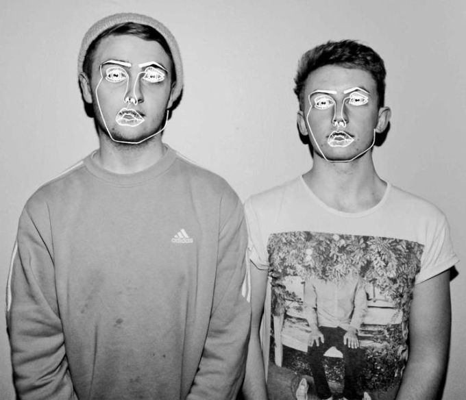
A way I will attempt to do this is to add a drawn over design which is a current design trend, such as the Disclosure drawn format. Colours will need to be thought and thoroughly and the background and text sizes adjusted but for now the typefaces and fashion of my models is the only really modern part of the poster which I need to push up.


This style can also be used to reinforce that gender we all have the same spirit and to not initially judge characteristics based on gender and the rewritten stereotypes.
o


With slight drawn detail adding energy and fun to the concept, embracing youth and spirit of the people. Encouraging mimics.


Although I really love the idea of rewriting history so to speak, drawing on the new stereotypes that contrast traditional values, I couldn't replicate this to the perfection that i'd envision it to and feel it looks to gimmicky and tarnishes the message with its distracting bad drawing.


Simply enlarging the texts and adding some tone in the background, it may be more formal but I feel the colours, soft but bold headline tearing across the ad and powerful positive posture that resonated with its target audience during the war, and even more so in it's revival in the 80s to boost morale and I feel this is perhaps quite toned down but still a modern fresh take on the concept that will be recognisable.
No comments:
Post a Comment