Monday, April 25, 2016

Evaluation

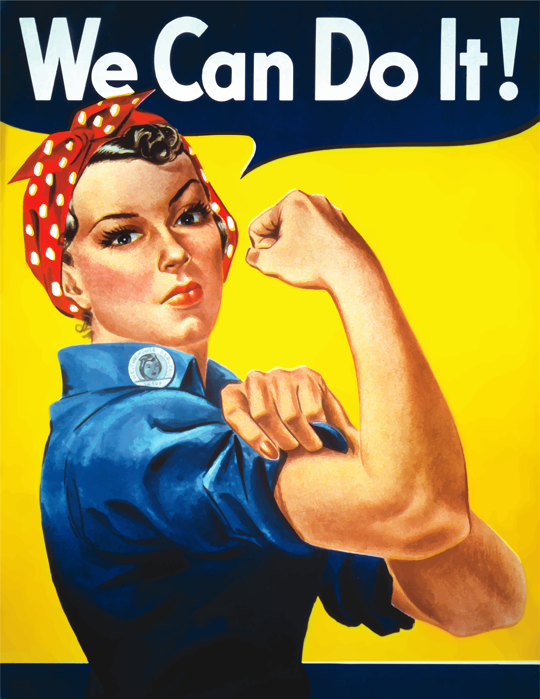
Completing this module, I needed a result that had fierce spirit and values that shone through through impactful design and a reminiscent style that for the last century has boosted morale for women in each decade. I finally decided on the inspiration of 'We can do it' as it is such a strong valuable image that doesn't rely on the norms of sexualising the woman, but making her strong and empowering women to do a mans job. A crucial point not taken in to consideration as much as I feel it could be, is why was it okay to completely discard women's successful efforts as soon as the men from war came home? Why was it then appropriate to be sexist again? I wanted to really boost this campaign with a modern fresh twist that unlike others, didn't use the colours and dress of the original, but completely revamp it to match with current and modern values. 

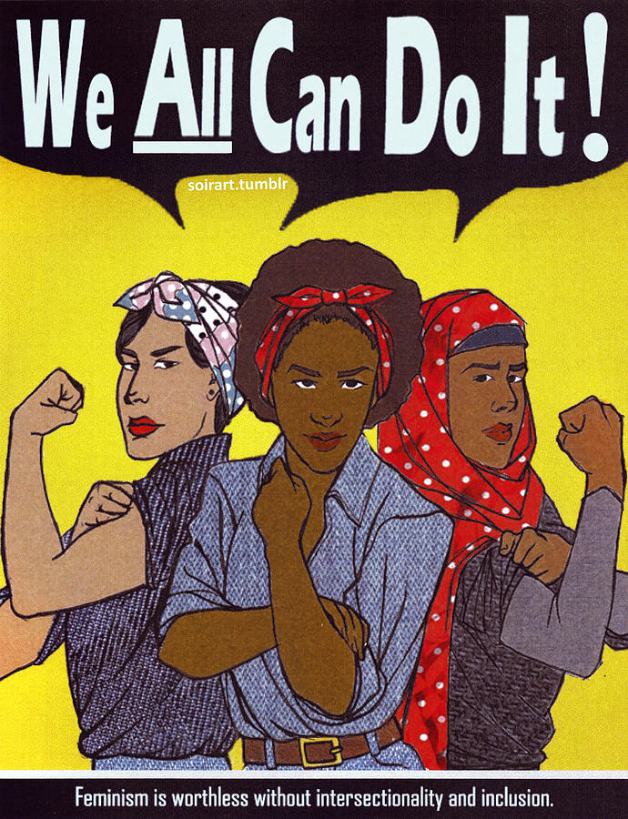
The contrast of the man with a pink background, and the woman with the blue is a subconscious stereotype we all have associated with gender that I am contrasting with the two models showing the same strength and spirit, and solidarity/unison of all working together and showing equality. 

The fresh overpaint look of the title is rewriting the embedded inequality of history and is made to be seen from afar by all audiences and shock them in to the modern reality. All genders are strong and all are capable of being successful and work to the best of their abilities. No longer is the stereotype of the man going to work and the woman babysitting. The point I am trying to make is that we all should have equal opportunities as we are all capable and the strong spirit I want to get across I'd hope to encourage people that walk by. I am not using sexually suggestive imagery to gain attention, no gimmicks or environment to give a preconception (which perhaps my first initial idea in the pub would do), but simply displaying the strength of both man and woman in solidarity and equality with a motivating, positive but impacting spirit on the general public.

If I were to expand this campaign, I would use models of all ages and genders, possibly even together to really appeal to the mass audience I am reaching out to. Also, because perhaps the age range that would have the biggest issue would be older or religious, therefore using them in these ads would be extremely affective and would make them unmissable to anyone as they'd truly relate. Using young, regular successful young adults however fits the new wave of feminism's age range and is beneficial in reaching out to a younger audience who will in turn impact future generations of which I want to eradicate gender inequality. I feel this nature of design resonates with my essay very well, with the serious undertone with an upbeat hopeful optimistic overlay.

'The pressure and attitudes towards women is the backlash that cannot be ignored. Countries in the world where women are being abused on the street on a day to day basis need these ideas of gender roles to be switched, and advertising has one of the most powerful effects on the masses. Feminists have long wished for the eradication of sexual violence and objectification notably arising in the 1800’s, without much success. '

'It is crushing to know many women in different parts of the world don’t have the voice, but in the West there is an uproar that needs to be heard.'

The symbol is added to demonstrate how this would be an ad for a feminist campaign, a reminder that feminism is for equality overall and not for women to be more important than men but for all to be equally treated.


Poster Adjustments

Approaching others for feedback on my early stages of development, it was agreed that it really needed a modern day touch to really bring the concept forward and relate to audiences as the in trend, modern way of thinking that will shake them up in to feeling old fashioned and dated in their views.

A way I will attempt to do this is to add a drawn over design which is a current design trend, such as the Disclosure drawn format. Colours will need to be thought and thoroughly and the background and text sizes adjusted but for now the typefaces and fashion of my models is the only really modern part of the poster which I need to push up.


This style can also be used to reinforce that gender we all have the same spirit and to not initially judge characteristics based on gender and the rewritten stereotypes.

o


With slight drawn detail adding energy and fun to the concept, embracing youth and spirit of the people. Encouraging mimics.


Although I really love the idea of rewriting history so to speak, drawing on the new stereotypes that contrast traditional values, I couldn't replicate this to the perfection that i'd envision it to and feel it looks to gimmicky and tarnishes the message with its distracting bad drawing.


Simply enlarging the texts and adding some tone in the background, it may be more formal but I feel the colours, soft but bold headline tearing across the ad and powerful positive posture that resonated with its target audience during the war, and even more so in it's revival in the 80s to boost morale and I feel this is perhaps quite toned down but still a modern fresh take on the concept that will be recognisable.


Sunday, April 24, 2016

Advertisement Production

Now I have completed my shoot in the studio, using two women and a man giving me th poe option to explore a range of potential final advertisements. I want to experiment with close variations of my updated 'we can do it campaign' using both 'we can still do it' or 'we can all do it.' This is to ensure I get the solid message of the outcome portrayed correctly ready for hand in. Not having my models in the vintage ensemble means I am completely remaking these, but will try and encorporate the typeface and colours used to match the iconic pose but this is meant to be a new direction for this idea modernising peoples views and opinions on gender stereotyping.

The closest to the typeface I could find had to be bought, so I decided to go my own way and use one I feel more represents modern day statement text, going with my point of sterotypes being out of date the style of the poster is itself. I found a strong, modern typeface 'Brandon Grotesque' similar to the original but I didn't think its softness made the important statement I am trying to make.In the posters time of the war the text was light motivation to boost worker morale as it was a sensitive situation at the time as the women's husbands and sons were out fighting the war therefore it had to be light in its message but strong in image, whereas with these ads I want the message to be seen at full force.

A bold capital font would get the message across that this is something that needs to be taken in to consideration, that it's time for these stereotypes to change; this needs to grab attention from all directions. As this is so important for this advertising to work, I researched which were the top impactful headline fonts and those used most by designers allowing me to choose the one that stands out most and that is used most in this modern day to make this modernized campaign work to its full potential.

https://designschool.canva.com/blog/headline-font/

Franchise- demonstrates power and strength through its all capital character


The bold font- used in my initial billboard which seemed succesful with those I showed it to which isn't as rigid and has a softness to it

Asking others and thinking about it myself, I feel the bold font is still as loud eyecatching and strong as the other, but has more of a spirit to it which I want portrayed through the advertising whereas Franchise is a little rigid.

If it were to be done in my first attempt style I would use blue/pink reversed and it would look like this


Thursday, April 21, 2016

Ad campaign plan

I have been rattling my brain of how I can successfully include the spirit of my essay through advertising and have had the ideas of cut out dolls/blue and pink/stereotype switch but with much confusion of how to portray them in the correct way with impact. I realised it needs to be clear to others and if it isn't clear to myself then it would be unsuccessful.


The ad that has come to mind and is very famous but the reality pretty much discarded after WW2 was the 'We can do it' poster encouraging women to take on men's roles why they were away at war. If i were to recreate this as a modern version, either for women with the tagline 'we can still do it' highlighting the disregard of the women's effort and inequality brought back when the men returned from war. I think this would be a pretty powerful campaign as the pose and poster is well known and the familiarity will make audiences connect to it more, and the simple image and tagline are bold and direct enough to get across my point that they were encouraged to take control when the men weren't here and did well at it, why was this completely disregarded? Especially as we are nearly a century on. These could be ads for UN Women or similar organisations, or a made up campaign to give it the backbone it needs to be for gender in advertising as social advertisements on equality all have the organisation small in the corner to give the person seeing it a directory to help create change, but allowing the advertisement to be strong and direct message to stick in the persons mind.

This could also be done one ad a woman and another a man, with the tagline 'we can all do it'. This would be a very positive message in comparison to my initial poster mockup which is probably quite aggressive and wouldn't sit well with all women for lifestyle/religious reasons. This sort of modernised campaign will give empowerment and motivation, and reflects the hopeful and positive tone of voice of my essay that the gender gap will lessen over the coming years.

What I love about the Riveter poster is its bold straight to the point message, strong stance of the working woman whilst still with the touch of femininity and elegancy which I want to uphold in my work. Femininity is to be celebrated but strength and abilities not underestimated because of it. For example, in my essay when I discuss quotes from Hollywood superstars getting annoyed at belittling comments because they are a woman, asking all the intellectual questions to the male actor.

This American propaganda poster to boost worker morale was actually seen very little in wartime but was rediscovered in the 1980's, and has been used for feminist campaigns and other political issues due to its clear and direct meaning. 'Feminists and others have seized upon the uplifting attitude and apparent message to remake the image into many different forms, including self empowerment, campaign promotion, advertising, and parodies.' (source Wikipedia)


A standard recreation of the poster, due to Beyonce's superstardom she has the power to implement these ethics.

This Malala graffiti version has the deeper meaning and effect addressing modern day issues that strike us all, and it has the essence of no superficial money making aim being put up but done to promote change and address serious issues. My posters would be put up for these purposes, not done to promote a company.


Having multicultural context and the coming together of women from all over the world is very successful in modernising the original design and empowering women from all walks of life which is extremely important when it comes to the issue of gender equality as it is needing to continue spreading across the world where women are still treated as second class citizens which is a point I made in my essay.


There have been other versions of this poster but not many that go beyond the original tagline and I think this could be taken further. Many mimic the same style as the woman in the picture but I would want to focus on todays fashion and not look to the past, as I want this to move forward and connect with the younger generations to ensure this rise of gender equality continues to soar. I want to also make the point that gender stereotypes are out of date/old fashioned and to get images in this style of dress would go against that point. This was created nearly a century ago and deserves a remaking as it is such a powerful poster which I don't want for the purposes of propaganda, but social change.


I want the tagline to have this sort of effect, shocking people in to getting with the times and how old fashioned their views are in a direct and clear manner

Monday, April 18, 2016

Adjustments and interim crit

Despite having the idea of showing men and women with reversed clothing and demonstrating the built in stereotyping of the colours blue and pink, I could not nail the point in a simple and striking way.

For the crit I quickly mocked up the kind of billboard/poster and it's message I would want to portray, by role reversal. This gained more praise than my cut out doll idea and peers liked the straight to the point message being portrayed, the contrast of femininity from being well presented and wearing makeup/into fashion, but enjoys drinking and going to the pub which is a common male stereotype. The vivid black and white contrast strips accross the billboard representing the clean and new embedded messages of equality I am trying to implement to provoke thoughts of passersby who catch it from a long or short distance, as it is bold striking and clear.


I plan to get more high res images in the studio and perhaps use the pink and blue concept but my main focus is on women fitting 'manly' stereotypes in a modern and stylish manner as I want to shock the old fashioned and wake them up to the modern generation y's viewpoints which I feel ties in and celebrates my essay's point alot more which is why I am going in this direction. I want the firing of empowerment of change and a more positive, accepting equal society and work in the spirit spoken about in my essay of these stereotypes being questioned in mainstream media.

To gain a variety of options for my final outcomes and to get the most effective results I asked my peers what they associate with male stereotypes I could focus on through my photography.

Drinking, domestic abuse, men's health,Gym lads,strong, confident, manly, authoritative, wise,Beards, muscles, sexist, sport loving, into cars, blue and red, gamers, smelly, hairy, no fashion sense, adulterous (cheaters), comfortable with porn but uncomfortable with sexuality, bad with emotions, never ask for help, bad at cooking, dirty, unimaginative

Friday, April 1, 2016

Gender colours advertisements

Using the strong stereotype drilled in to our minds since birth of seperating much more than our genders, pink and blue are a fast way of defining gender. can be reversed to prove a point of does it really matter


role reversal to highlight issues of gender stereotyping